LeaveHomeSafe
Enhancing Accessibility for Aging Users in Covid-19 Contact Tracing

LeaveHomeSafe
Enhancing Accessibility for Aging Users in Covid-19 Contact Tracing

Role

UX designer
UX researcher

Timeline

Dec 2022

Tool

Figma

Platform

Mobile app

Skills

User research
Information architecture
Interaction design
Prototyping
Usability testing

LeaveHomeSafe
Enhancing Accessibility for Aging Users in Covid-19 Contact Tracing

Role

UX designer
UX researcher

Timeline

Dec 2022

Tool

Figma

Tool

Figma

Platform

Mobile app

Skills

User research
Information architecture
Interaction design
Prototyping
Usability testing

What if public health technology didn't leave older population behind?

What if public health technology didn't leave older population behind?

OVERVIEW

LeaveHomeSafe, Hong Kong's mandatory Covid-19 contact tracing app, serves as a critical public health tool for both locals and travelers. The app allows users to store their Vaccine Pass, record their visit history, and receive Covid-19 exposure notifications. After observing my older family members struggle with the interface, I initiated this redesign project to enhance the app's accessibility and user experience.

PROBLEM

In 2020, the Hong Kong government launched LeaveHomeSafe. Its primary function was to aid Covid-19 contact tracing by requiring users to scan QR codes when entering premises. Despite its vital role in daily life, the app faced criticism for being difficult to use, particularly for seniors.


The mandatory nature of the app meant that usability issues weren't just inconveniences, but barriers to essential public services and venues for many.

RESEARCH

USER INTERVIEWS

USER INTERVIEWS

IDENTIFYING SENIOR USERS' FRICTION POINTS

IDENTIFYING SENIOR USERS' FRICTION POINTS

To gain insights into user pain points, I conducted qualitative research through interviews with seven users aged 45-60. This demographic was chosen specifically as they represented a significant user group that faced persistent challenges with the app. The research focused on understanding how users interacted with key features and where they encountered difficulties in their daily usage. Key usability issues were identified:

INFORMATION OVERLOAD

INFORMATION OVERLOAD

The home screen presented six text-heavy cards. Users struggled to distinguish between essential and secondary information. Critical features were buried within dense content blocks.

NON-INTUITIVE NAVIGATION

NON-INTUITIVE NAVIGATION

Notification system placement in the bottom left corner defied common UI patterns. The crucial Vaccine Pass feature was minimized despite its high usage frequency. Important features were not prioritized based on user needs.

LACK OF VISUAL DISTINCTION

LACK OF VISUAL DISTINCTION

All buttons were in either green or yellow, and critical actions like "delete" were not visually distinct from regular actions. This led to frequent user errors.

FRAGMENTED USER FLOWS

FRAGMENTED USER FLOWS

Visit record management was split across multiple screens. Users had to view their visit history on the "Visit Records" page, and go to the home page to upload the records.

USER PERSONA

USER PERSONA

DIVING INTO THE USER'S MINDSET

DIVING INTO THE USER'S MINDSET

The research findings also guided me to create a persona representing the primary user group that faced the most challenges with the app.

OPPORTUNITY

How might we make LeaveHomeSafe more accessible to seniors while streamlining the contact tracing experience?

How might we make LeaveHomeSafe more accessible to seniors while streamlining the contact tracing experience?

IDEATION

INFORMATION ARCHITECTURE

INFORMATION ARCHITECTURE

REDESIGNING FOR CLARITY AND ACCESS

REDESIGNING FOR CLARITY AND ACCESS

Based on the research insights and our persona's needs, I focused on restructuring the app's information architecture to create a more intuitive experience with three core principles:

  • Prioritize core functions

  • Simplify navigation structure

  • Improve feature discoverability

SOLUTION

REDESIGNING THE USER EXPERIENCE

With a clear understanding of user needs and restructured information architecture, I redesigned LeaveHomeSafe to create an intuitive interface that would help senior users complete their daily tasks with confidence.

REDESIGNING THE USER EXPERIENCE

SIMPLIFIED HOME PAGE

SIMPLIFIED HOME PAGE

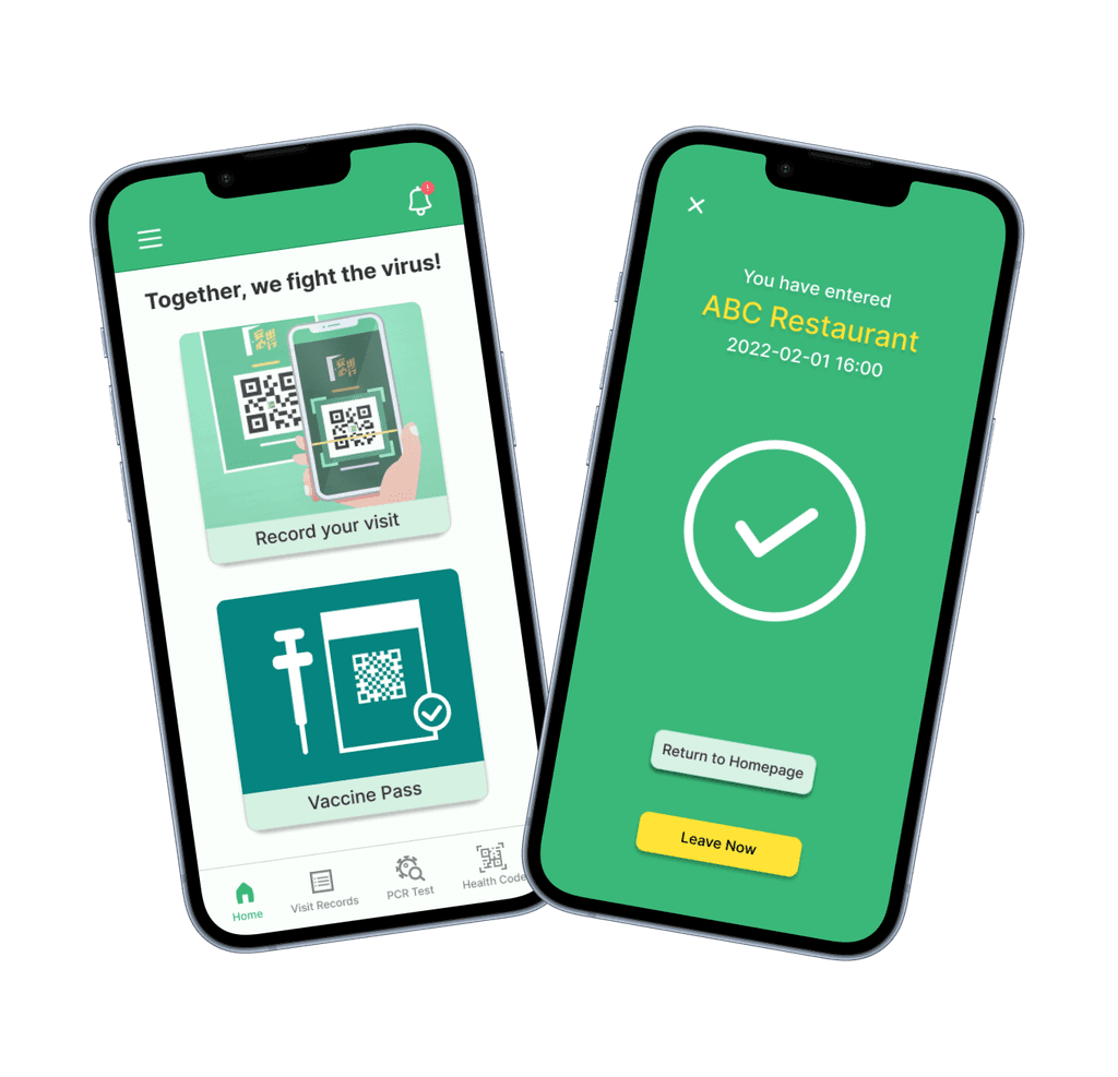
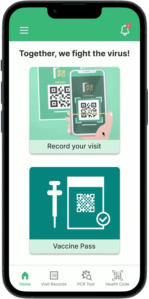
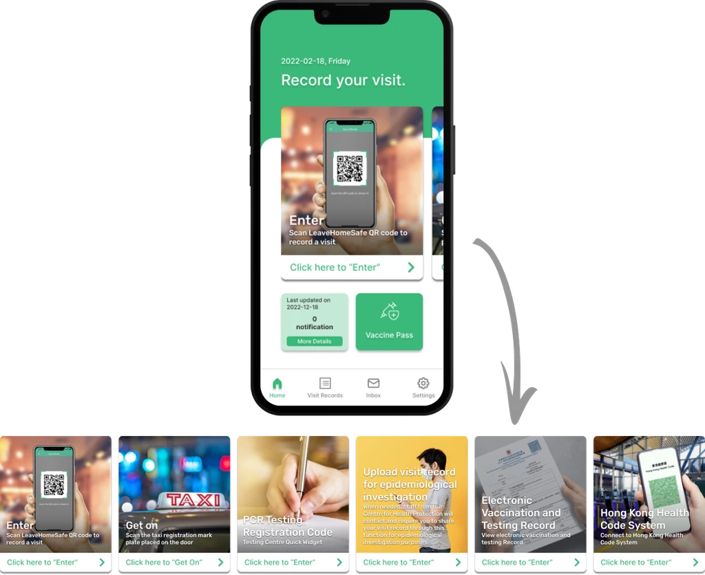
I reduced the home interface to two primary cards: "Record Your Visit" and "Vaccine Pass," as these are the features users need daily. Secondary functions like PCR Testing and Health Code System were moved to the bottom navigation bar, creating a clearer hierarchy based on usage frequency.

UNIFIED VISIT RECORDING

UNIFIED VISIT RECORDING

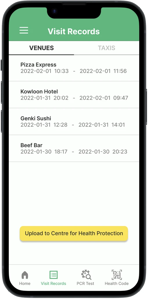
I consolidated venue check-ins and taxi rides under a single "Record Your Visit" function. This creates a more logical flow for users, eliminating the confusion of having to switch between separate recording systems.

STREAMLINED RECORD MANAGEMENT

STREAMLINED RECORD MANAGEMENT

I reorganized the visit record system by moving the "Upload Visit Record" button from the home page to the Visit Records page. This allows users to view their history and upload records to the Centre for Health Protection in one location, eliminating unnecessary navigation between pages.

INTUITIVE NOTIFICATIONS

INTUITIVE NOTIFICATIONS

The notification system was moved from the bottom-left corner to a standard top-right position, using a bell icon with a red indicator for new notifications. This change not only is more intuitive and saves screen space, but also provides clearer feedback about when users need to take action.

BUTTON DIFFERENTIATION

BUTTON DIFFERENTIATION

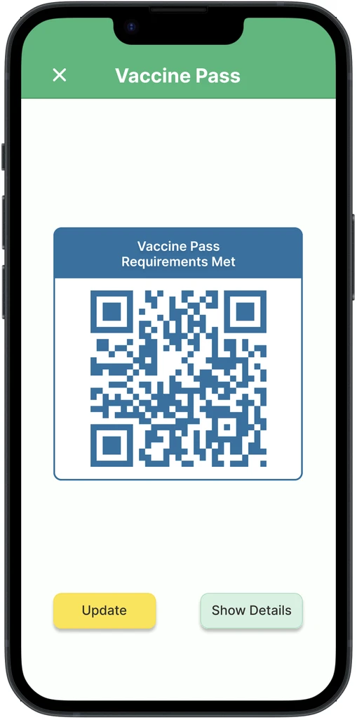
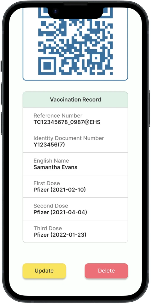
Destructive actions like delete buttons are now highlighted in red, creating a clear contrast with the standard green and yellow used for positive actions. This helps users distinguish between different types of actions, preventing accidental deletions.

TESTING

LISTENING TO FEEDBACK

To validate the redesign and gather feedback, I conducted task-oriented usability studies with four participants from the initial research phase. Using a think-aloud protocol, participants completed the following tasks while sharing their thoughts and reactions:

  • Recording a visit to a venue

  • Viewing the Vaccine Pass

  • Viewing and uploading visit records

  • Viewing Covid-19 exposure notifications

The testing revealed significant improvements in user experience, with participants expressing increased confidence and satisfaction:

ITERATION

ITERATING BASED ON FEEDBACK

While the overall feedback was positive, testing revealed an opportunity for further improvement in the visit records organization:

ITERATING BASED ON FEEDBACK

VISIT RECORDS REFINEMENT

VISIT RECORDS REFINEMENT

The initial design combined venue and taxi ride records on a single page. However, user feedback indicated this created confusion.


In response, I separated these into two distinct tabs, making the information more organized and easier to scan.

The initial design combined venue and taxi ride records on a single page. However, user feedback indicated this created confusion.


In response, I separated these into two distinct tabs, making the information more organized and easier to scan.

TAKEAWAY

SIMPLICITY IS THE KEY

SIMPLICITY IS THE KEY

Information architecture plays a crucial role in user experience. By reducing the home page to essential features and logically grouping related content, the redesign transformed an overwhelming interface into an intuitive one. This reinforced that successful UX design isn't about including everything—it's about presenting the right information at the right time.

Let's bridge the gap between people and technology together.

Made with ❤️ by Hedy Hui.

Let's bridge the gap between people and technology together.

Made with ❤️ by Hedy Hui.

Let's bridge the gap between people and technology together.

Made with ❤️ by Hedy Hui.