


ROLE
Product Designer
TIMELINE
TEAM
2 Designers
1 Engineer
1 UX Researcher
TOOL
Figma
TL;DR
With over 800k users, picoCTF is a cybersecurity education platform teaching users how to solve Capture The Flag (CTF) through hands-on practice. As the lead product designer on this capstone project, I redesigned the platform to tackle beginner drop-off issues, introducing structured learning paths, gamified rewards, and an AI-powered reflection feature.
The redesigned platform is part of picoCTF's product roadmap.
PROBLEM
800k+ users, but 39.5% dropped off.
Despite having 800k+ users worldwide, picoCTF faced a significant engagement issue: 39.5% of users dropped off after solving only 1–10 practices.

Users were interested enough to sign up, but why didn't they stay?
RESEARCH INSIGHTS
Lack of guidance and scaffolding made it hard for users to start, learn, and continue.
From analyzing 531 survey responses and interviewing 25 users, I identified key pain points across the beginner journey.


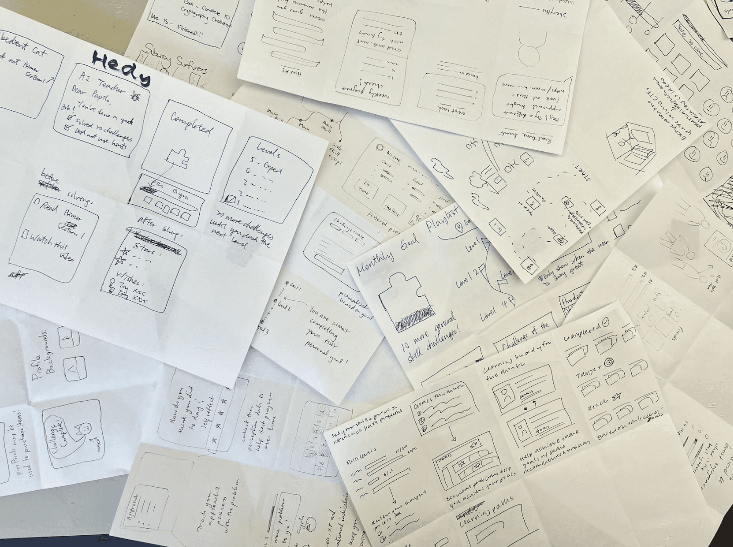
DESIGN DECISIONS & ITERATIONS
I. How might we structure learning content so beginners know what to learn?
Pain Point: Many new users dropped off because they did not know where to start and struggled to locate relevant learning resources.
Frontloading All Learning Materials

Users could preview everything upfront

Overwhelming for beginners; too much information before application
Intermixing Tutorials & Practices
Reduces cognitive load
Encourages immediate application of concepts
Chosen for final design!
II. How might we make progress visible to motivate beginners?
Pain Point: Beginners received no feedback on their growth, leaving them unsure of their progress and less motivated to continue.
Leaderboard Rankings
Hard to earn for beginners
Emphasized competition over personal growth
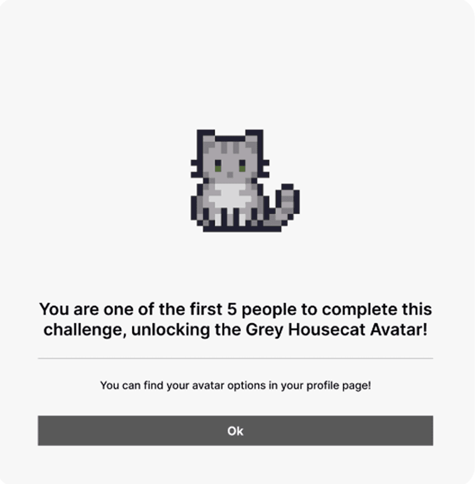
Mascot Animations
Fun, cute visuals
Unclear how it reflected skill development
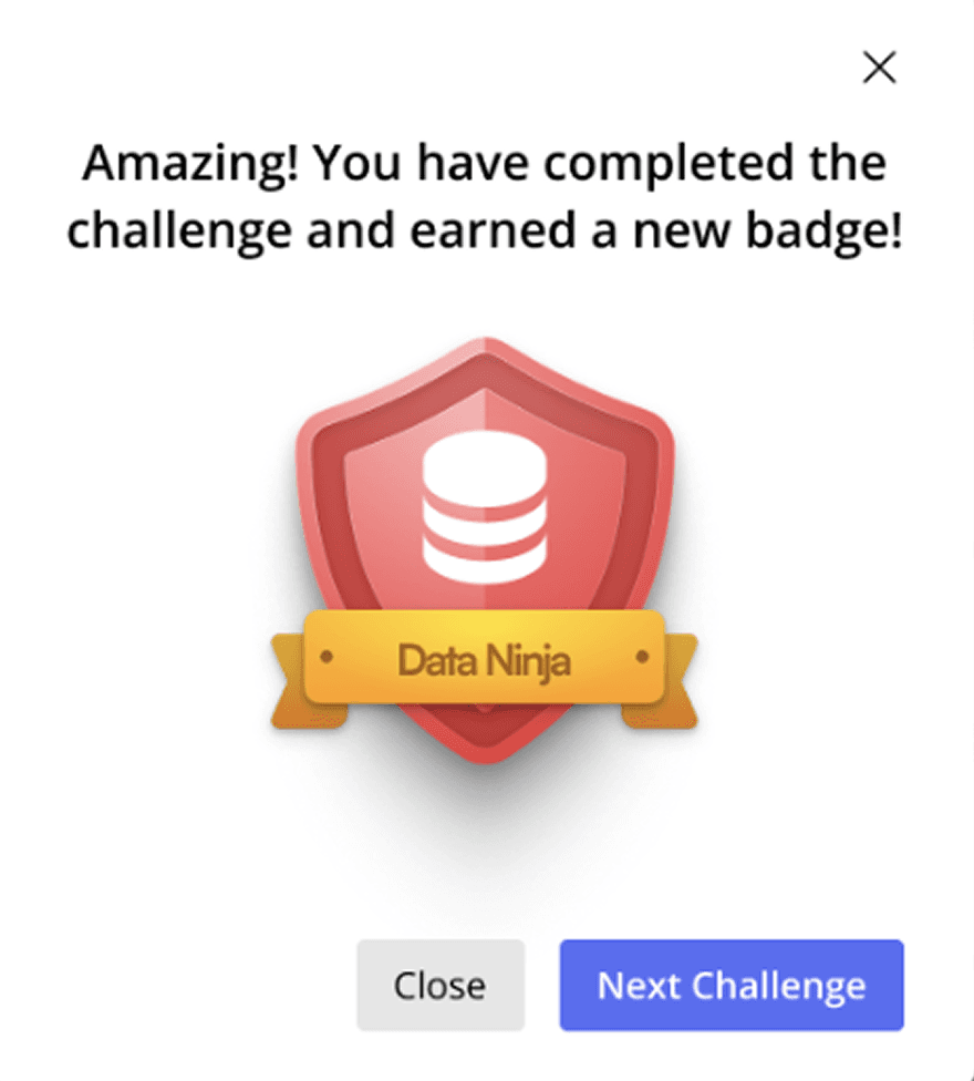
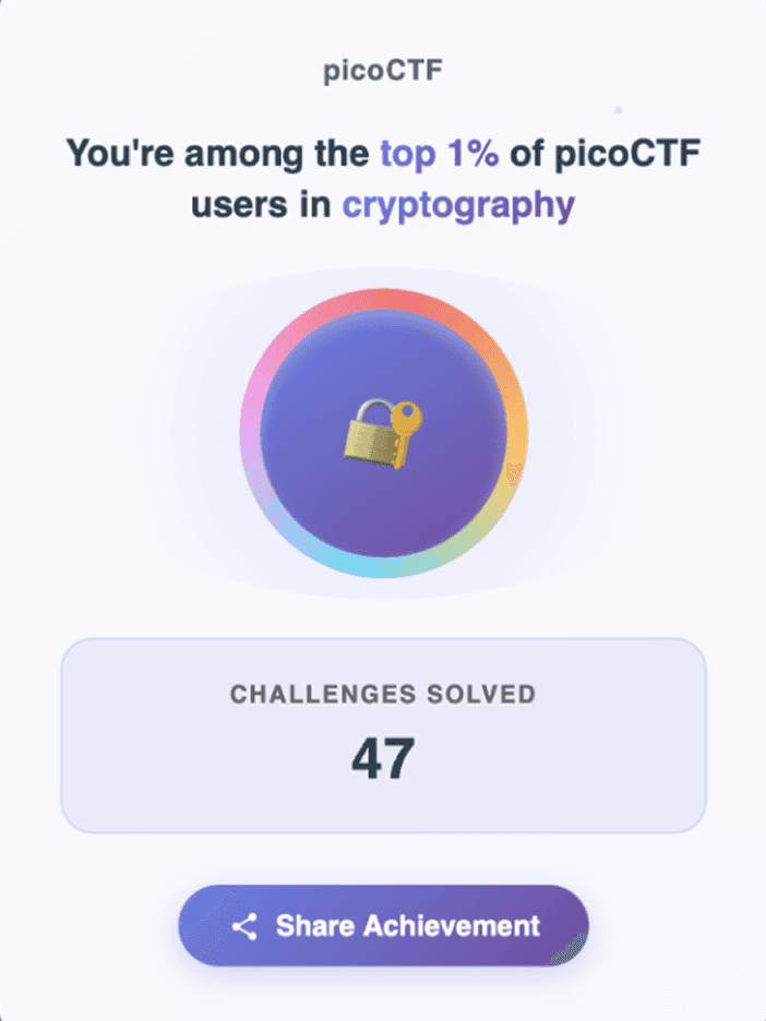
Achievement Badges
Encourages consistency
Links effort to skill growth
Chosen for final design!
III. How might we help beginners reflect on their learning?
Pain Point: Even after completing practices, users often did not internalize strategies or understand mistakes.
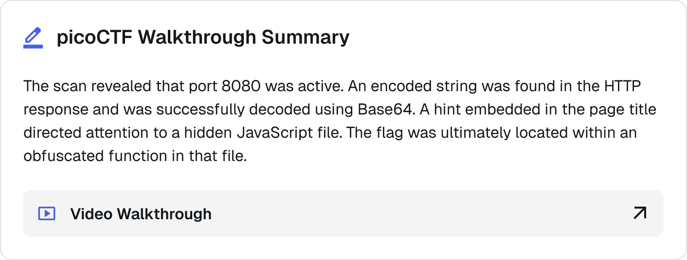
Iteration I: Walkthrough Summaries Only
Users could review official walkthroughs after completing a challenge.

No active learning: users passively read solutions without reflecting on their own approach.
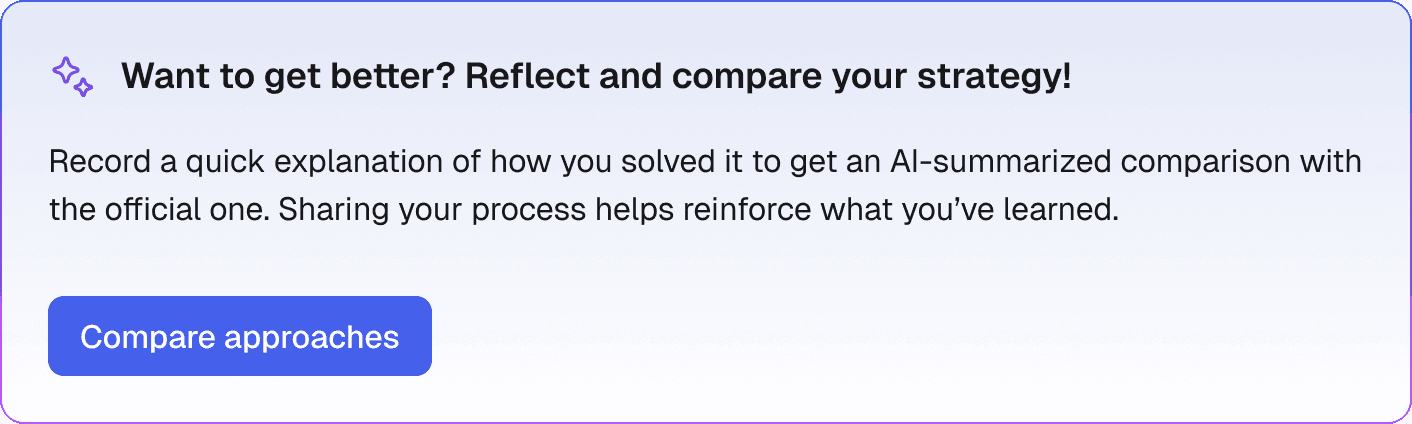
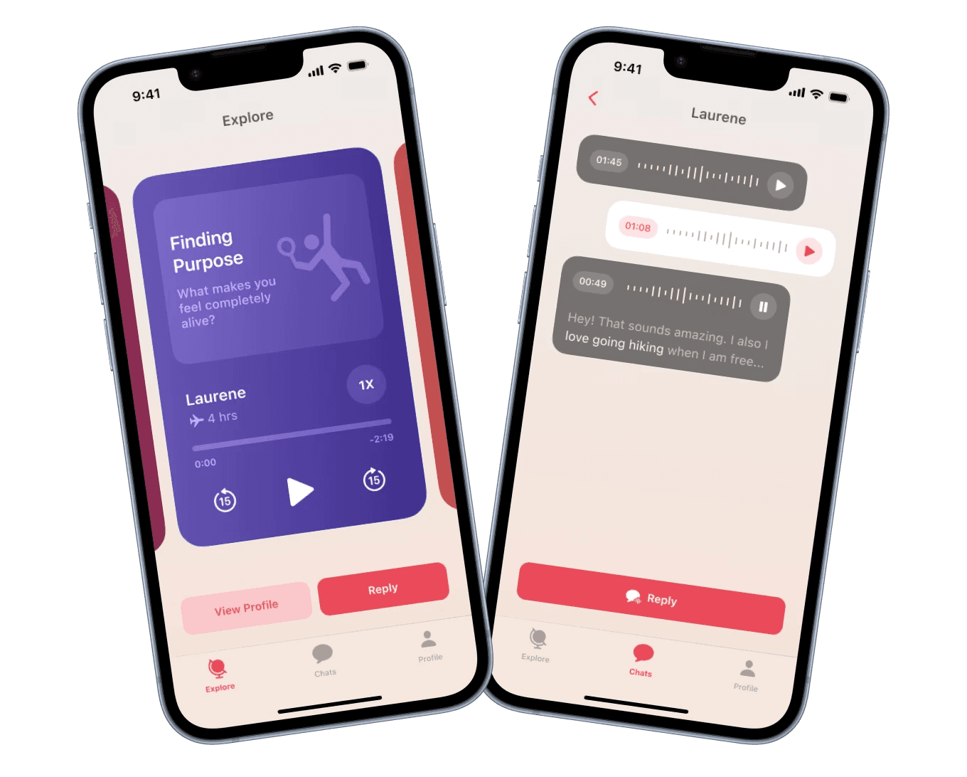
Iteration II: AI-Powered Strategy Reflection
I added the option for users to dictate or type reflections. AI would then compare their approach with expert solutions.
Promotes deep learning and self-assessment
Highlights gaps in understanding
Dual input modes to support diverse needs

SOLUTION
Help cybersecurity beginners stay engaged through guidance, momentum, and reinforcement
I. GUIDANCE
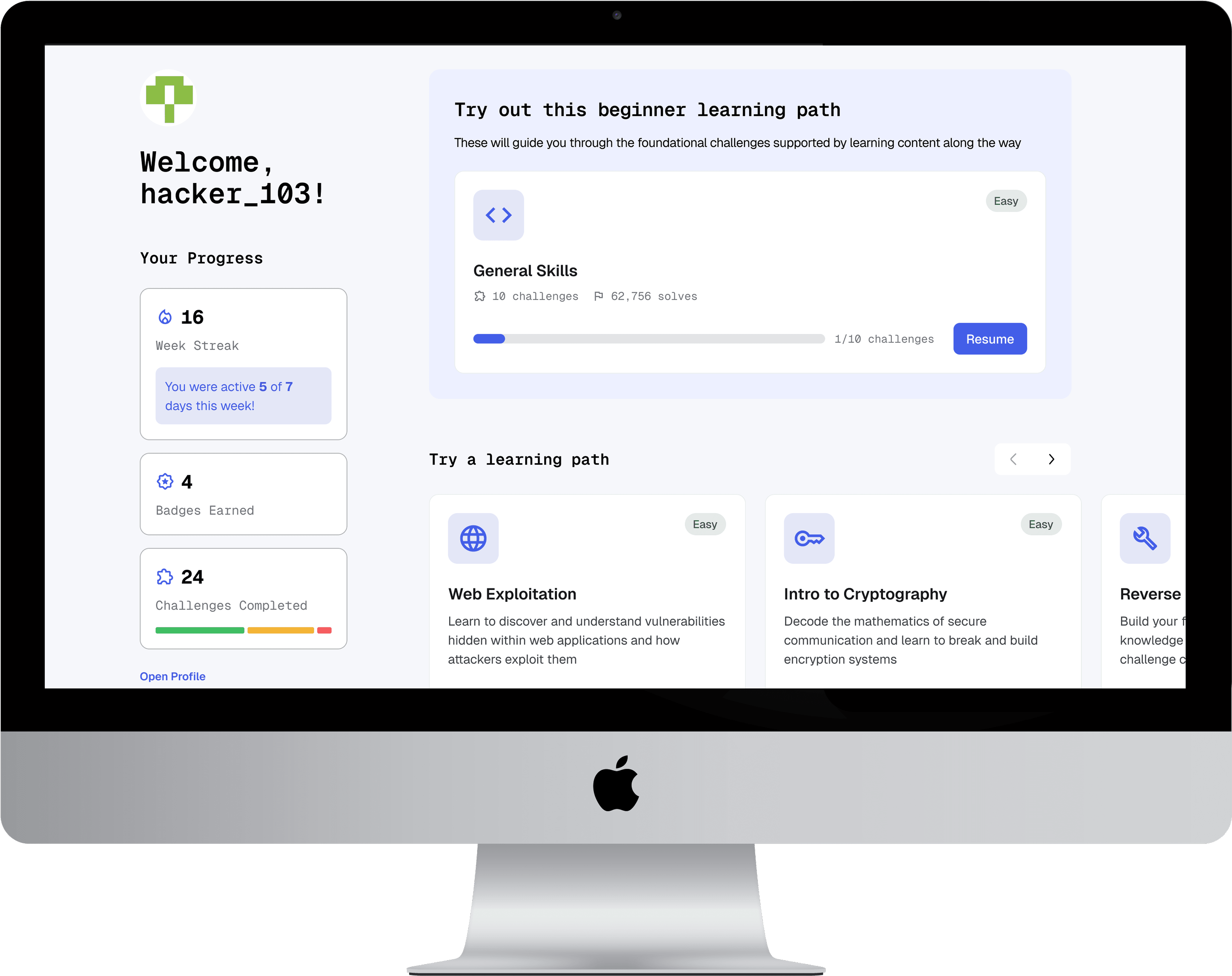
Homepage to orient beginners from the start
As the lack of a homepage left new users disoriented, I designed one to serve as a central hub that recommends starting paths and surfaces essential learning resources, giving users a clear first step.
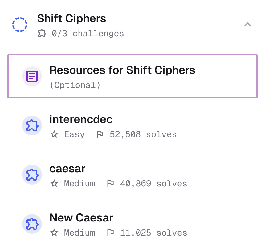
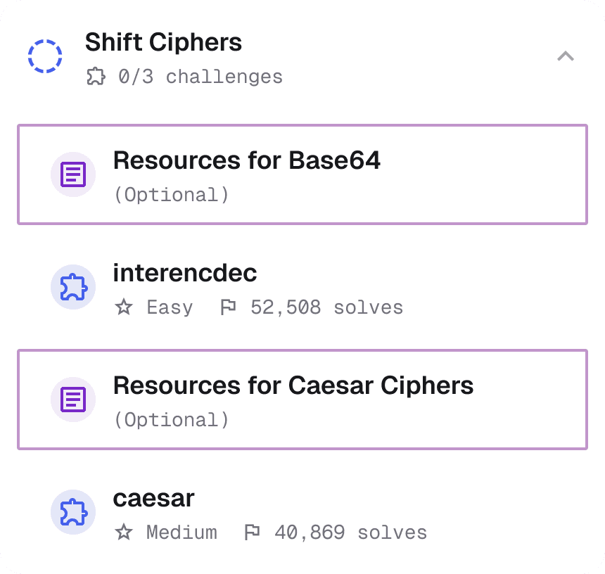
Structured learning paths that teach skills step-by-step
I created topic-based learning paths with practices grouped by theme and increasing difficulty, paired with integrated tutorials. This provides a structured track for skill-building and ensures users get essential input before attempting challenges.
II. MOMENTUM
Celebrate progress and encourage continued learning
After completing a learning path, users see a summary of skills gained and earn a badge to reinforce their effort. They are also recommended next paths to help them keep their momentum.
Redesigned profile that makes growth visible
I redesigned the profile to include an activity log and visual progression across skills and paths, encouraging consistent engagement and helping users track their improvement over time.
III. REINFORCEMENT
AI-powered reflections to help beginners learn deeply, not just get answers
Beginners often solved practices without understanding why their solution worked. I designed an optional reflection feature where users can document their thought process, and AI compares it to expert strategies. This helps them internalize key concepts and develop problem-solving skills.
HANDOFF
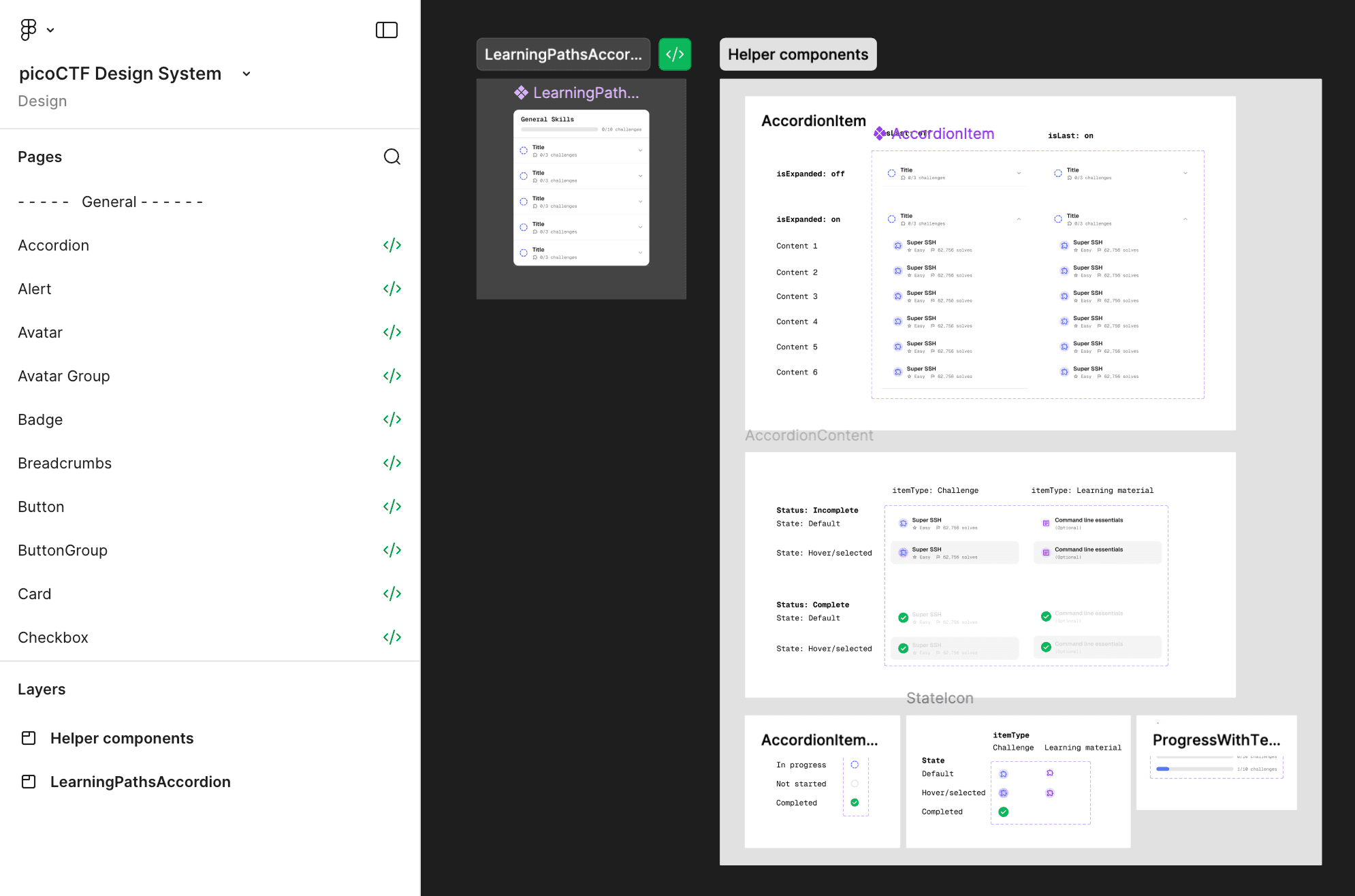
Adapting the HeroUI design system
Rather than building a new design system from scratch, we customized the HeroUI design system to meet picoCTF's needs. This allowed us to maintain visual consistency while speeding up development by reusing existing components.
IMPACT
SUS Score
Users rated our redesigned platform an 86 on the System Usability Scale, well above the industry benchmark of 68.

Beginner Confidence Score
Among 15 beginner users, the confidence score improved from 3.2 to 3.8 (on a 5-point scale) with our redesigned platform.
+
0.0
0.0
TAKEAWAYS
Design for Confidence, Not Just Completion
I realized that engagement is not just about finishing practices; it's about helping users feel capable and supported when using our platform to learn.
Balance Guidance with Autonomy
I learned that it is crucial to give users enough structure to reduce overwhelm while still allowing self-exploration. This balance ensures both beginners and advanced users can thrive.
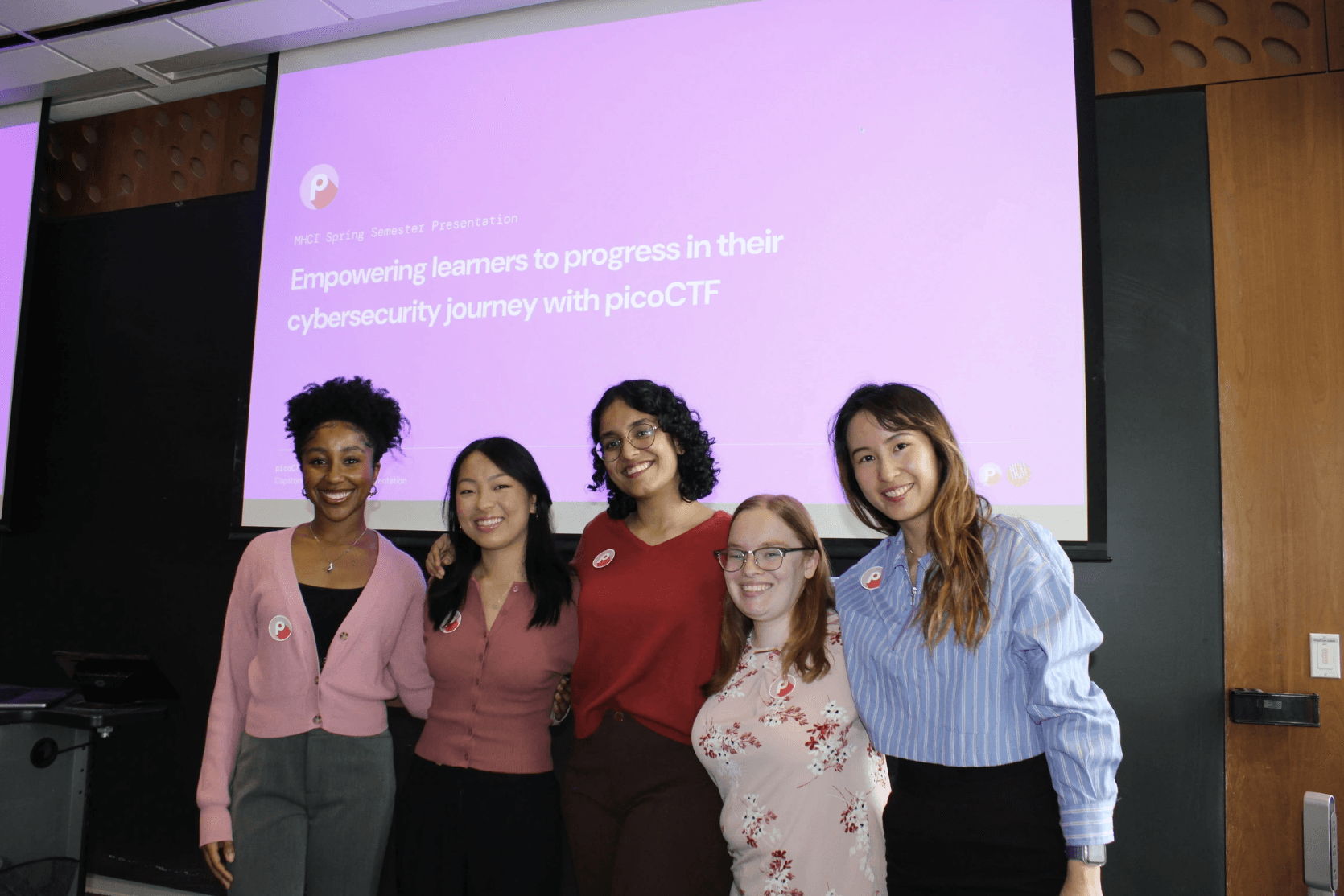


Shoutout to my amazing teammates!
CHECK OUT OTHER PROJECTS: